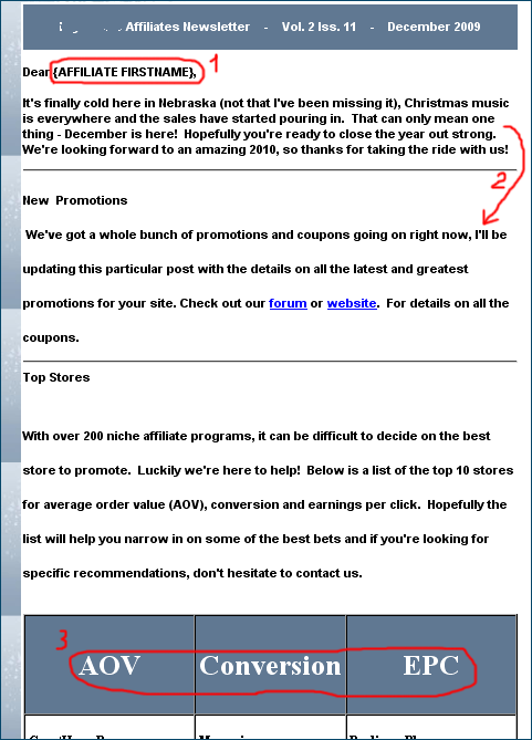
A solid online retailer, voted one of Internet Retailer’s Hot 100 Companies of 2009, visited by over a million of unique visitors every month, has sent out their affiliate newsletter. It was written well, but some of the things could certainly use some improvement. Here’s a screenshot of a part of that newsletter:

Good style, but the formatting of your affiliate newsletters deserves a much closer attention! (1) The short code for the affiliate’s first name has never translated into the first name, but stayed in the short code form (the affiliate program manager must have made a mistake in the code). (2) The paragraph line spacing has suddenly jumped from single to double (starting from the second paragraph), to never return to the single form again. (3) The font type and size choice hasn’t been great at all. The whole newsletter is typed up in bold font, and I could count as many as three different types of fonts, and three different sizes (often within the same type of font).
I know I’ve mentioned it before, but it’s worth repeating. Prior to sending out your affiliate newsletter, by all means preview it and, whenever possible, send yourself a test email with it (to ensure it will look nice and clean on the affiliate end). Otherwise, regardless of how well you write, it’ll quickly show that you haven’t put enough time/effort into it.
Geno,
We’ve been working on setting up our email campaigns for launch in January 2010.
You’re always so timely – Thanks!
Thanks, Denis, and glad to be of help. You may also want to check out the https://www.amnavigator.com/blog/tag/affiliate-newsletter/ tag. There are 6 more blog articles you may find of use.
Geno,
Thanks for the additional links! Most valuable.
When I was first trying to piece together a newsletter for our affiliates, I subscribed to many newsletters across many other niches in order to see what was most pleasing both aesthetically as well as content wise.
I found that I could bring together a lot of the many different elements of what made the other newsletters work so well and come up with a template or outline of our own.
I think it has worked nicely.
@Denis: You’re most welcome.
@Ron: Smart approach! Competitive intelligence is a must in this business.
I recognize that email. :D. I love being addressed as Affiliate Firstname. Titles make me feel important :D!